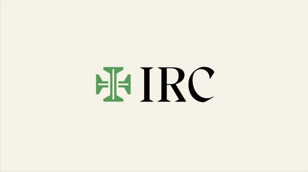
We’ve adopted a logo for Immanuel Reformed Church. It’s built around a green “I” for “Immanuel,” which forms the vertical axis of a cross.
Beyond that, the design brilliantly captures the meaning of “Immanuel” and our aspirations as a church. Notice a few things:
- Historically, green is the color of Trinity season, also known as “ordinary time,” because there aren’t any major Christian feasts during this season. By putting the “I” of “Immanuel” in the green of ordinary time, the logo reminds us God is God-with-us at all times.
- Green is the color of Eden, the promised land, and the future garden-city, new Jerusalem (Rev 22:1-5). On the logo, green stretches in four directions, a reminder that God intends to restore the four corners of the earth. All creation will be greened; all will be “Edenified.”
- The cross spreads out in four directions, vertically from heaven to sheol, horizontally from sunrise to sunset. So too, the church’s mission is to bring everything in heaven, earth, and under the earth under the sign of Immanuel, to imprint the cross of Jesus on the cosmos.
- I like the “channels” in the middle of both the “I” and the horizontal beam of the cross. The “I” of Immanuel is a vertical channel, representing Immanuel/Jesus who brings the life and glory of heaven to earth. He forms a horizontal channel, the water of the Spirit spreading out to green the earth.
- The horizontal parts of the cross look like chairs, pulled up at the long table of the “I.” This signifies our desire to be a hospitable church, welcoming sinners to the Lord’s table and ours. The long table of the “I” links us to heaven; the world is greened as we receive Immanuel in the Lord’s Supper.
Immanuel Reformed Church exists to realize the vision of our logo in Birmingham, Alabama. We witness, pray, worship, eat, drink, and work so our beloved city will become a preview of the future Jerusalem.
Blessings,
Pastor Leithart

Leave a comment